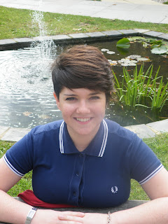
This image is the one I have chosen to feature on the front of the magazine. I like it because the colous and bright and inviting and there is just enough shadow on her face. She is slightly to the side which gives a casual friendly feeling, inviting the reader into the magazine. I think this image will work well because it meets all the conventions my target market ask for and is aesthetically pleasing.

This is one of my favourite images that I have taken. The lighting and shadow is just right and Charlie is the main focal point. However, I think that the image is a bit too formal as it is taken straight on and does not have a relaxed feel.

I do like this image, although I feel as though I am too zoomed out, and there isn't enough figure in the photo. At the bottom of the frame there is quite a lot of the bench so the photo isn't framed very well. I will not be using this image for my front cover.

I like this image as it fulfills the brief in being a medium close up of a student. It could be used as the image for my front cover but it's not as good as it could be. The colourful cardigan takes the focus away from the students face, and the whole image isn't in perfect focus. I would be more likely to use this image for my contents page.
Hello there
ReplyDelete